Wondering how restaurant websites are improving navigation and user experience? Your restaurant’s website design serves as your virtual storefront. It doesn’t matter what type of restaurant you have– your website’s navigation and user experience can make or break a potential customer’s decision to visit.
In this blog post, the experts at 714WEB will discuss how restaurant websites are improving navigation and user experience.
Key Takeaways:
- Mobile-first design approaches are essential for capturing on-the-go diners.
- Streamlined navigation and clear information boost user engagement.
- Professional visuals and brand storytelling create emotional connections.
How Are Restaurant Websites Improving Navigation and User Experience? – 7 Methods
1. Mobile-First Design and Metrics
Our SEO experts at 714WEB explain,
“The key to capturing today’s dining audience is thinking not just mobile-first, but mobile-friendly.”
This means designing your website with smartphone users as your primary audience. Modern restaurant websites are incorporating:
- Touch-friendly buttons sized appropriately for finger taps
- Click-to-call functionality for instant phone calls
- Responsive layouts that adapt to any screen size
- Fast-loading pages optimized for mobile data connections

For restaurants, this is particularly crucial during major events or holidays in your city, when tourists search for dining options on their phones while exploring.
Mobile performance metrics are also becoming increasingly important for determining search engine rankings. Successful restaurant websites should implement the following:
- Progressive loading techniques that display crucial information first
- Compressed images that maintain quality while reducing load time
- Simplified layouts that eliminate unnecessary scrolling
- Mobile-specific menus that are easy to navigate with one hand
For food trucks and pop-up restaurants, mobile optimization is even more crucial, as customers need to keep up with your locations and/or daily specials while on the move.
2. Streamlined Navigation
Modern restaurant websites are improving their navigation to help visitors find information quickly. There are two ways to do this:
Linked Logos: Most sites now feature logos that link back to the homepage, eliminating the need for a dedicated “Home” button and clearing up valuable navigation space.
Clear Menu Categories: Navigation items are being reduced to essential categories like Menu, Reservations, Order Online, Contact, and About.
Our team at 714WEB notes,
“The most successful restaurant websites we’ve designed keep their main navigation to five items or fewer.”
3. Menu Presentation
Restaurants are revolutionizing how they present their menus online, making them more user-friendly and SEO-optimized. Modern menu pages should feature:
- Organized sections with clear headings
- Interactive tabs or tiles for different breakfast, brunch, lunch, dinner, and dessert
- Dietary and allergen filters
- High-quality food photography
- Detailed dish descriptions that incorporate relevant keywords
It’s also beneficial to use keywords based around any famous dishes or experiences that you offer. For example, restaurants in Nashville might include local search terms like “Nashville hot chicken” or “Music City brunch” naturally within menu descriptions. Using terms like this can help you better capture audiences looking for as specific dining experience.
4. Streamlined Online Ordering and Reservations
Our experts at 714WEB say,
“A complicated ordering system can cost you customers faster than anything else.”
Modern restaurant websites are integrating:
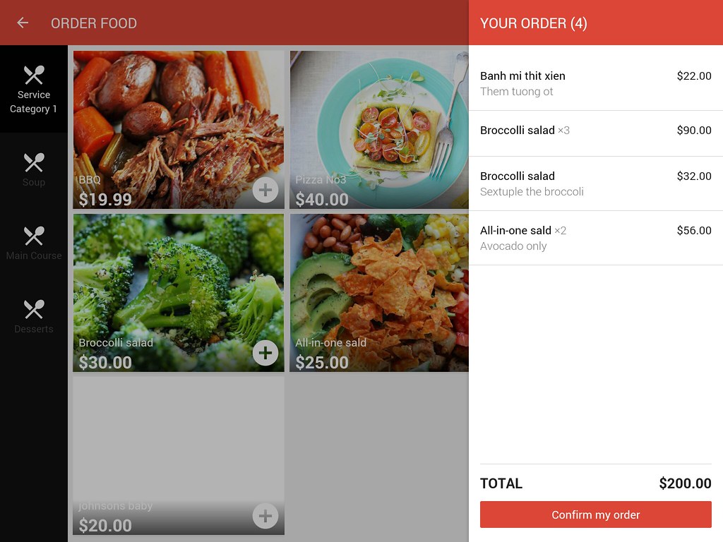
- One-click reservation buttons
- Streamlined checkout processes
- Clear delivery zones and pickup instructions
- Integration with popular delivery platforms like DoorDash and Grubhub
- Mobile-friendly payment systems
An effective online ordering system is especially important for restaurants in business districts or tourist areas, where lunch orders need to be quick and efficient.
Modern restaurant websites are also incorporating:
- Pre-ordering capabilities for busy lunch hours
- Group ordering features for corporate events
- Special event booking systems
- Customizable catering requests
- Real-time updates on availability
5. Easy-to-Find Essential Information
Critical information should be displayed prominently on your site. The five most important aspects of your restaurant include:
- Hours of operation
- Contact details
- Location with embedded maps
- Parking information
- Special event calendars
It can also help to include information about parking during music festivals or other major events downtown.
6. Professional Visuals and Brand Storytelling
Modern restaurant websites are moving beyond simple food photos to create immersive visual experiences. Our SEO team at 714WEB explains,
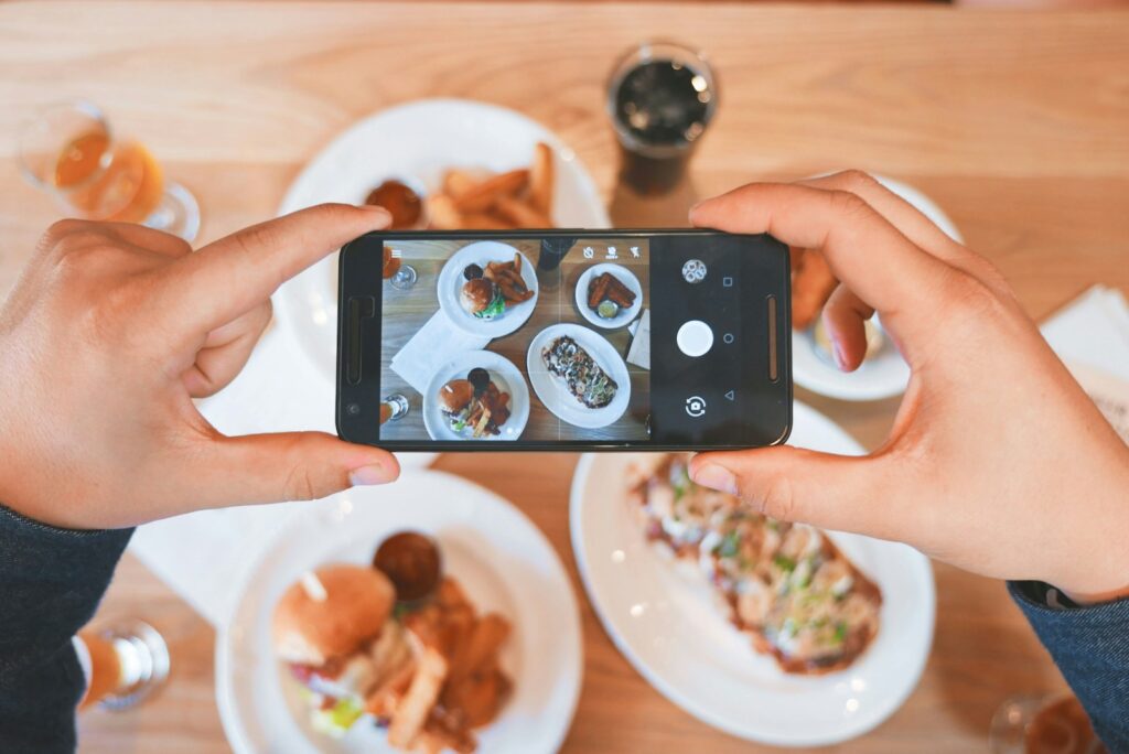
“Your website should tell your restaurant’s story before visitors read a single word.”
The best way to tell your story and show customers who you are is through:
- Professional food photography
- Virtual tours inside your restaurant
- Behind-the-scenes content
- Staff spotlights
- Telling your brand story
7. SEO Optimization
Restaurants are implementing sophisticated SEO strategies to improve their visibility in local searches. A comprehensive SEO strategy includes:
- Optimizing for local keywords
- Using schema markup
- Including location-based landing pages
- Making regular content updates
- Optimizing for mobile performance
It can also help to optimize for neighborhood-specific searches and popular local events that drive dining traffic.
What is the Impact of Improved Navigation on Conversion Rates?
These improvements can create significant results in converting website visitors into customers. Implementing these types of changes can give you higher engagement rates, increased online orders, and more reservations.
Mobile optimization alone can dramatically improve your conversion rates, as more users are willing to complete transactions on well-designed mobile sites.
Remember that a comprehensive approach to website improvement focuses on creating an intuitive, efficient, and engaging user experience that benefits your customers. The better you serve your customers, the more you’ll be able to improve your visibility in local search results.
Contact the Restaurant Web Design Experts at 714WEB
At 714WEB, we specialize in helping restaurants improve navigation and user experience. Our team of experts can help you craft an optimized website that resonates with your target audience, no matter what stage of the customer journey they’re at. From multimedia integration to strategic content creation and SEO, we have the skills and knowledge to bring your restaurant to life online.
Don’t let your restaurant get lost in the digital shuffle. Contact 714WEB today for a free consultation and discover how we can help you create a mobile-optimized website that not only tells your story but also drives more loyal diners to your tables.
Frequently Asked Questions About Improving Navigation and User Experience
How are restaurants simplifying their website navigation menus?
Restaurants are limiting the number of menu options and using short, concise names for menu items to improve clarity. Many implement dropdown menus to organize content without cluttering the main navigation bar. Additionally, some restaurants link their logo to the homepage, eliminating the need for a separate “Home” button in the navigation.
What mobile-friendly features are restaurants incorporating into their websites?
Restaurants are prioritizing responsive design to ensure their websites adapt to different screen sizes. They’re implementing mobile-specific elements like touch-friendly buttons and click-to-call functionality. Additionally, restaurants are focusing on quick load times for mobile devices to prevent user frustration.
How are restaurants improving the presentation of their menus online?
Many restaurants are using tiles or tabs to present their menu options, allowing users to easily navigate different categories without endless scrolling. They also include high-quality photos and detailed descriptions of dishes, along with dietary information. Some are implementing search functions to help users quickly find specific menu items.
Glossary
1. Responsive Design: A website design approach that automatically adjusts content and layout to fit different screen sizes and devices. For restaurant websites, this ensures a seamless user experience whether customers are browsing on a smartphone, tablet, or desktop computer.
2. Hamburger Menu: A compact navigation icon consisting of three horizontal lines that expands into a full menu when clicked. This design saves screen space on mobile devices while providing easy access to website navigation options.
3. Breadcrumb Navigation: A secondary navigation technique that shows users their current location within a website’s hierarchy. It allows customers to easily trace back their steps or jump to parent pages without using the main menu.

Jeremy Caris
With a disciplined background in the military and over 30 years in design and development, Jeremy serves as the technical backbone of 714Web. He has managed, designed, and launched over 300 website projects in the last decade alone. Currently, Jeremy leads the agency’s initiatives in AI development and custom solutions, leveraging ten years of Senior Developer experience to ensure client infrastructure is not just functional, but cutting-edge and scalable. Read more...